
Overview
The Meraki Community serves 100,000+ network engineers who rely on it for time-sensitive troubleshooting. Adopting Cisco’s unified design system was an opportunity to build user trust, create consistency, and align with Cisco as a brand.
However, the challenge was balancing technical feasibility, limited budget, and adapting components for a forum-based experience.
My scope included:
design (information architecture, high fidelity drafts, prototyping)
design system adoption strategy
user testing
post-launch analysis
Challenge
Unifying design systems across multiple enterprise products
Customers (network engineers) wanted a more consistent experience across Cisco products, especially to find product-related information to support troubleshooting.
While there was internal support to adopt the design system, there were three main risks across stakeholders:
Limited budget
Leadership wanted assurance the investment would deliver a cohesive experience.
Minimal disruption to troubleshooting
Community team wanted scoped changes to avoid confusing troubleshooting.
Technical feasibility
Design system team needed visual alignment, since components couldn't be shared.
Discovery
Translating a design system the platform wasn’t built for
Since the community platform hadn’t transitioned to React, we had to figure out how feasible it was to adopt Cisco’s design system. I worked with our platform consultant to map design system components to community platform equivalents:
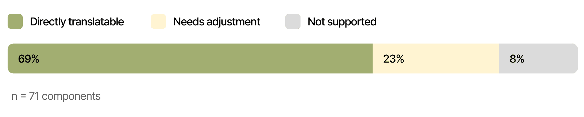
Any components that weren’t directly translatable were assessed in scoping.
Planning
Scoping the core experience within fixed budget
To address user needs of more easily finding information, we prioritized implementing global components, consisting of:
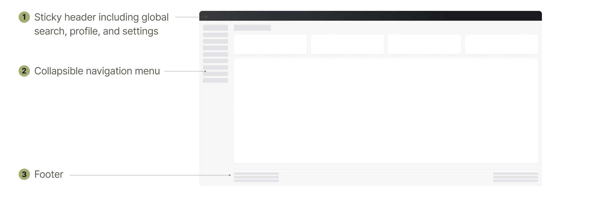
We also prioritized pages with the most usage:
Home
Primary entry point for all users
Forums
Core troubleshooting path for users
Threads
Where solutions are found
For gaps, I held design reviews with both teams to align on priorities and trade-offs within designs. I ran user testing before implementation to reduce disruption risk before anything shipped.
Design
Consistency, accessibility, and information architecture improve troubleshooting
Matching navigation with the dashboard mental model
Most users didn’t know they could jump between forums and groups. I added a new navigation menu and restructured the information architecture to match the product order users already knew from the Meraki dashboard, making navigation feel familiar without requiring them to relearn anything.
Improving conversation activity with accessibility
Relying on bold/non-bold titles to indicate unread threads were easy to miss and failed accessibility standards. I improved color contrast, link visibility, and introduced clear indicators for unread threads and solved answers.
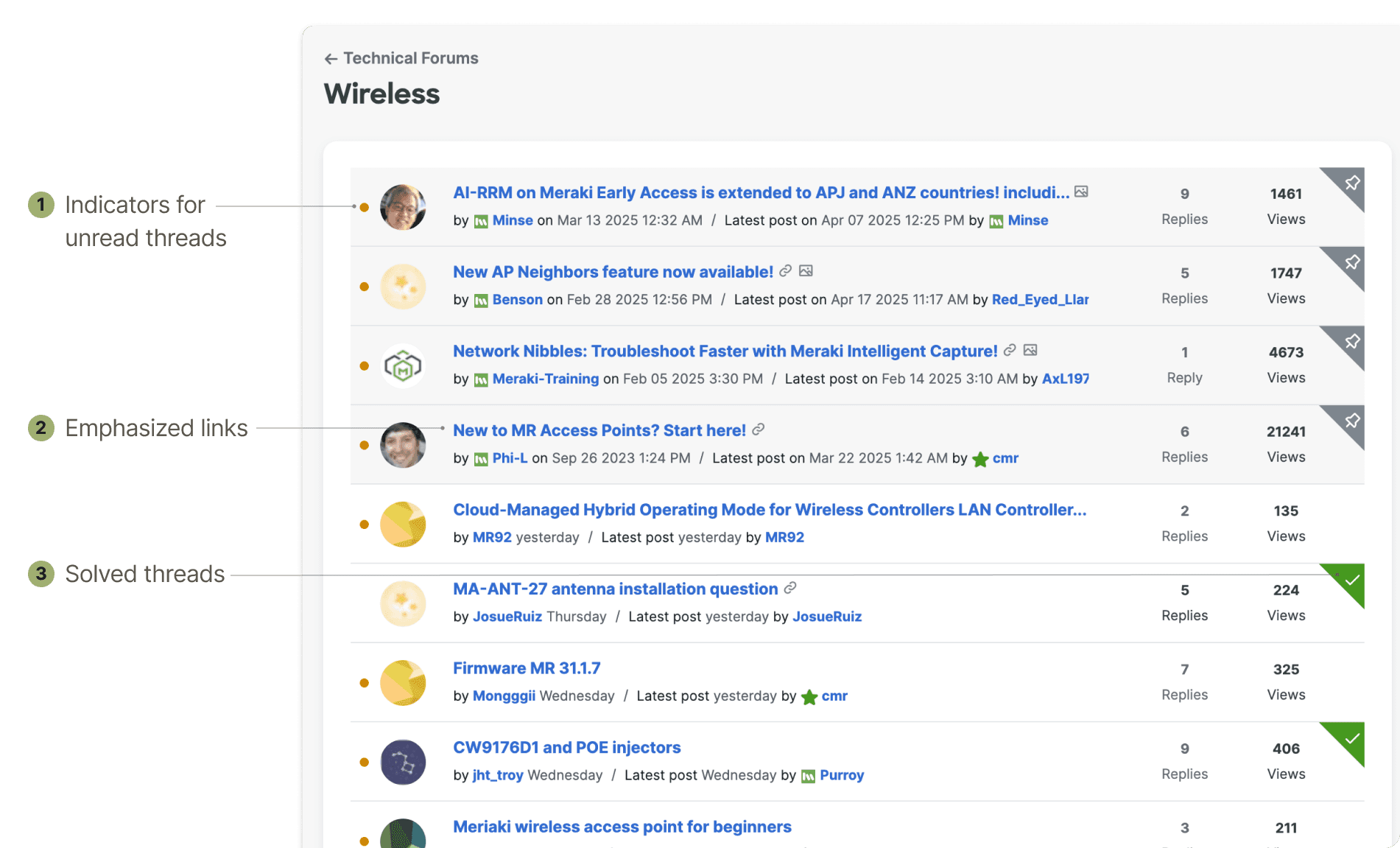
Designing information hierarchy for faster scanning
Engineers preferred dense layouts to reduce scrolling. I standardized typography, spacing, and iconography to create clearer visual hierarchy without reducing information density.
Impact
Highest CSAT rating for the community
+10%
increase in CSAT
70%
"Truly Satisfied" CSAT
Community users also shared feedback in improving engagement:
Reflection
Systems thinking considers the experience across platforms
Some components that worked in the dashboard didn't make sense in Community. We couldn't keep bolded titles to show unread threads since bold signaled links, so we needed a separate indicator. That's when I realized even a small addition like this changes how users scan the page.
That indicator wasn't in the design system yet, so I advocated adding it, adapting its color logic (warning vs. informational) to match what users already expected from the dashboard. Consistency across a system isn't about reusing components as-is, it's about preserving what they mean to users, even as context shifts.

